Project Management Guide
Project Management Guide
What Is Project Management?
What Is a Project?
Why Is Project Management Important?
Project Life Cycle Phases
- Project Initiation
- Project Planning
- Project Execution
- Project Monitoring
- Project Closure
Project Management Methodologies
- Waterfall Project Management
- Critical Path Method
- Critical Chain Project Management
- Agile Project Management
- Scrum Project Management
- Kanban Project Management
- Lean Project Management
- Six Sigma Project Management
- PRINCE2
- PRiSM
- PMBOK Method
Project Management FAQ
What Is Burndown Chart in Project Management?
Since managing a project can feel like a race against time, project managers have to exercise control to get work done and get it done fast. And to achieve this goal, they may deploy a range of tools or employ strategies that can help them stay on top of their game. A burndown chart is one such project management tool that can measure agility.
Keep reading to know more about the burndown chart, its meaning, types, advantages, and limitations.
What is a Burndown Chart?
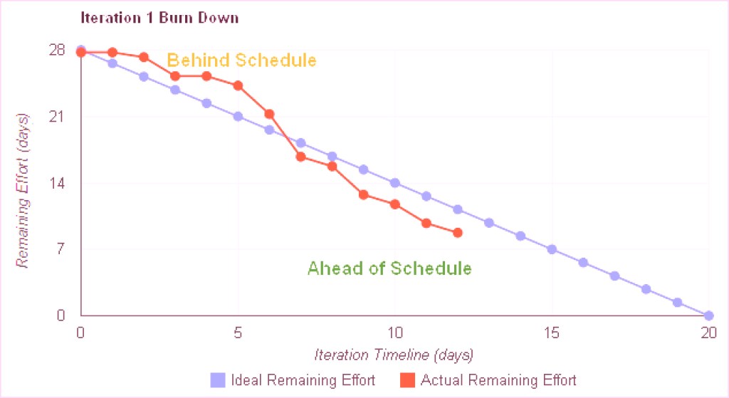
A project burndown chart or a project burndown rate chart is a graphical representation of the tasks to be completed within a defined timeframe. It depicts the total effort versus the amount of work and time required for every component.

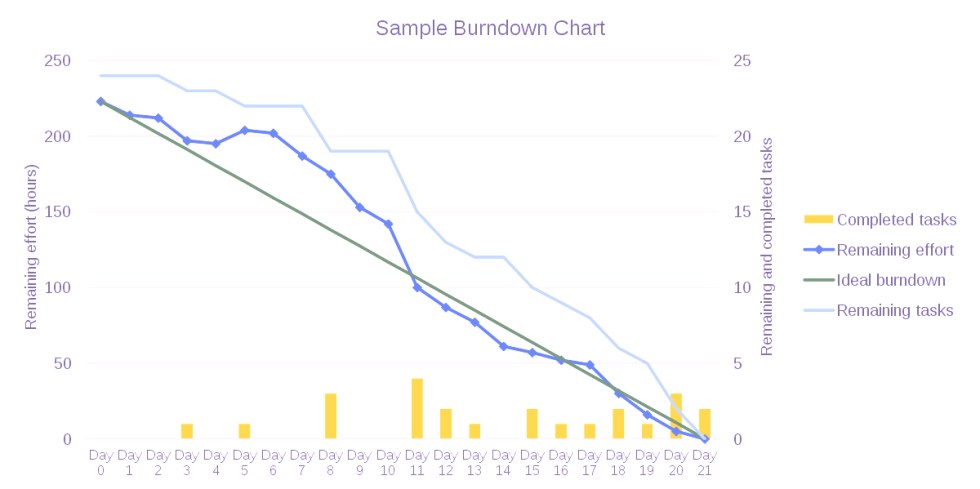
The number of tasks that are pending is shown along the y-axis, while the time elapsed is recorded along the x-axis. Under ideal conditions, the burndown takes place in a straight, downward line – the ideal work line, which cuts across the chart. However, events such as disruptions, backlogs, etc. can modify its course. And hence, the “actual effort” line captures and indicates the work or hours that went into the project for the said period while factoring in the changes.
The burndown chart derives its name and meaning from the fact that it indicates the decay of the number of activities required to complete the project as time progresses. In simpler words, the tasks will “burndown” as the project develops.
Burndown Chart: Examples and Variations
Since burndown charts are commonly used in Scrum projects, the different burndown chart examples and types are as follows:
Sprint Burndown Chart
As the name indicates, a Sprint burndown chart maps the rate of doing work for the Sprint – a short period within a long project.
Such burndown charts are useful for monitoring the complex and time-critical stages within a large project. And in such situations, the burndown chart rate corresponds to every Sprint. For instance, you could map a 10-day burndown chart frequency for a project that lasts a month.
Release Burndown Chart
A Release Burndown Chart corresponds to the progress of the releases within the Scrum project. It tracks the journey of the project from the developmental stage to where deliverables are released to the customers.
For a Release Burndown Chart, the sprints are positioned along the horizontal axis, while the work that is yet to be completed is marked along the vertical axis. The Scrum Master can use this chart to measure the team’s overall progress.
Product Burndown Chart
The Product Burndown Chart is a visual depiction of the amount of work that is yet to be completed to meet all the product goals. It contains all the story points corresponding to the work that is incomplete at the commencement of every Sprint. Project managers can refer to this chart while assessing the amount of work completed over time, and the amount of work that remains to complete the entire product.
Epic Burndown Chart
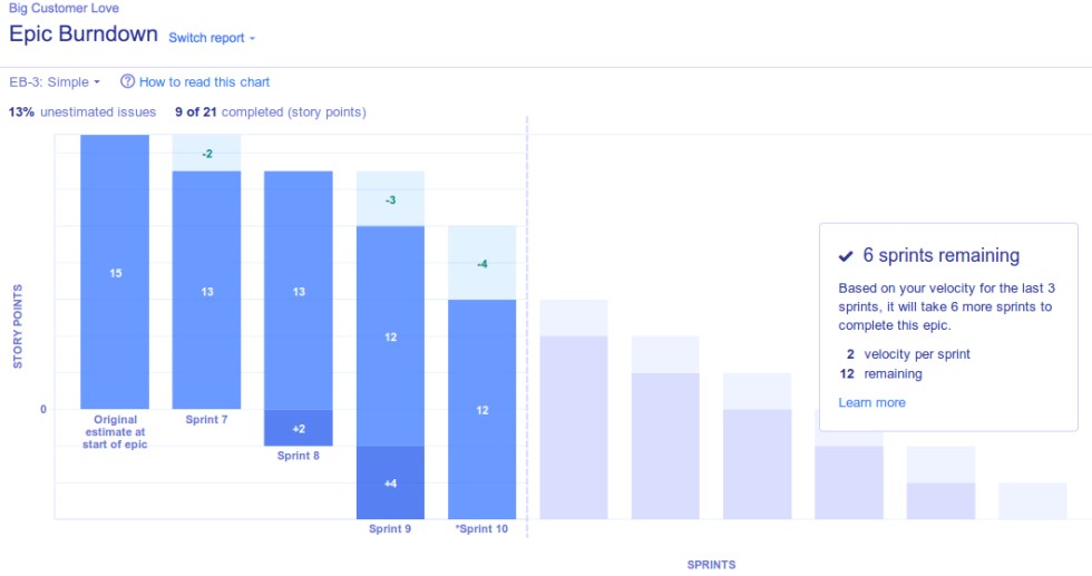
An Epic Burndown Chart is a cumulative report of all the Sprints that are required for completing an epic. Here, the burndown chart frequency details the sprint-by-sprint action to highlight the progress, scope, changes, and predictions right until completion. Since an Epic Burndown Chart offers a high-level view, Epic Burndown chart templates are displayed through color-coded blocks rather than lines.

Advantages of a Burndown Chart in Project Management
The use of Burndown Charts, either through Excel or specialized tools, can be quite helpful in maintaining agility. It helps project managers visualize the past, present, and future of the project and its progress.
Furthermore, the burndown chart also offers the following additional advantages:
- As data is illustrated in the visual format, they are easier to understand.
- Since it grants a real-time overview of the project’s progress, it can be used to update the team and motivate them to continue the good work or take reparative action.
- They provide a complete and larger picture of the project before the work commences, project managers can use it as a tool to manage resources and develop accurate timelines.
- It simplifies communication with clients and sets aside simple and clear expectations.
- As your project navigates through a journey that spans over opportunities, obstacles, and scope expansion, burndown charts help keep track of the evolving project requirements and timelines.
- It serves as a project blueprint or a baseline that helps identify whether or not you are on track.
- Since the burndown rate keeps a vigilant eye on the project-related changes, it can address bottlenecks, identify scope creep, and facilitate decision-making.
Limitations of a Burndown Chart in Project Management
While a Burndown Chart in Excel could address an array of issues, it does come with a few limitations. These being:
- It only offers a top-level view of the progress and fails to offer granular insights into the actual operations.
- Similarly, a Burndown Chart only tracks the changes and does not shed any light on the causes behind the deviations.
- A burndown chart is unable to visualize the technical debt, which could pose a problem later.
- The accuracy of the Ideal Work Line strongly depends on the capabilities of the burndown chart maker as they calculate the estimates and make predictions.
How to Read a Burndown Chart?
Let’s understand the process of reading a burndown chart using the following example:

- Start by reading the x-axis. Typically, it would be represented in days, weeks, or months. However, agile burndown charts may use story points as units.
- Then, observe the y-axis. The number right at the top of the chart is usually the indicator for the highest number of tasks.
- Next, read the Ideal Work Line. It generally starts at the top of the y-axis and trails to the lower right end near the x-axis. This line will consistently slope downwards but might also display stagnation through plateaus.
- Finally, read the Actual Effort Line. Compare it to the Ideal Work Line to note whether your team’s performance was at par, better, or worse than what the burndown chart maker predicted. Of course, this line would be visible only after you have started the project.
Final Thoughts
The burndown rate demonstrates the velocity at which your team is pushing the project towards completion. Use it to organize your project timelines and align them with your team’s efforts. With a burndown chart as your progress indicator, you can significantly improve the chances of project success!
